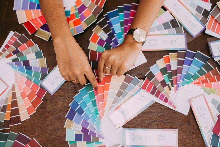
I’ve always found myself drawn to places and things that hold a certain visual intensity. It’s not about a simple preference for bright shades; it’s about the deliberate and impactful application of color that elevates the everyday into something more engaging. This fascination has led me to explore the concept of vibrant color palettes, not just as an aesthetic choice, but as a fundamental element of visual communication and emotional resonance.
Before I dive into specific applications, I need to establish a baseline of understanding regarding color theory. It’s the bedrock upon which all deliberate use of color is built, and for vibrant palettes, it’s particularly crucial. Without a grasp of how colors interact, the pursuit of vibrancy can easily devolve into chaos or a grating dissonance.
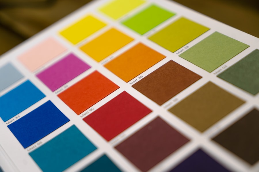
Hue, Saturation, and Value: The Core Components
My initial explorations always begin with the fundamental properties of color: hue, saturation, and value.
Hue: The Pure Color Itself
Hue refers to the pure color we perceive, like red, blue, or green. When I think about vibrancy, I often consider hues that have a high degree of pure spectral color. This means moving away from muted tones, grays, or browns and focusing on the unadulterated essence of a color. For instance, a deep emerald green is more vibrant than a muted sage.
Saturation: The Intensity of the Color
Saturation is essentially the purity or intensity of a color. A highly saturated color is vivid and rich, while a desaturated color appears duller, closer to gray. To achieve vibrancy, I aim for high saturation levels. This isn’t to say I exclusively use extremely high saturation, as that can be overwhelming, but the potential for high saturation in the chosen hues is key. Think of a clear, bright sky versus a hazy, overcast one – the sky’s vibrancy is a function of its high saturation.
Value: Lightness or Darkness
Value refers to how light or dark a color is. While vibrancy is often associated with light and bright colors, it’s important to remember that deep, rich colors can also be perceived as vibrant, provided they maintain their saturation. A deep, velvety crimson can be incredibly vibrant, even though it has a low value. The contrast between values within a palette also plays a significant role in how vibrant colors are perceived.
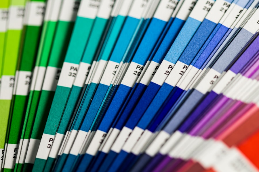
Color Relationships: Creating Harmony and Contrast
Understanding how different hues relate to each other on the color wheel is fundamental to creating effective and pleasing vibrant palettes.
Complementary Colors: The Apex of Contrast
Complementary colors are those opposite each other on the color wheel – red and green, blue and orange, yellow and violet. When placed side-by-side, they create the strongest possible contrast, which is a cornerstone of vibrancy. I often use this relationship strategically. A small accent of a highly saturated complementary color against a larger area of a less saturated hue can make both colors pop, imbuing the entire composition with energy. However, I’m mindful that using complementary colors in equal, high saturation proportions can be jarring. It requires careful balance.
Analogous Colors: Smooth Transitions
Analogous colors are next to each other on the color wheel, such as blue, blue-green, and green. While they don’t offer the same optical punch as complementary colors, they create a sense of harmony and flow. Within a vibrant palette, analogous colors can be used to create smooth transitions and a less aggressive visual experience, allowing the eye to move comfortably across the composition while still experiencing a rich and saturated environment.
Triadic and Tetradic Schemes: Bold Yet Balanced
Triadic schemes utilize three colors evenly spaced on the color wheel (e.g., red, yellow, blue). Tetradic schemes use four colors, typically two complementary pairs. These schemes are inherently bold and can produce very vibrant results. My approach here is to carefully select the dominant colors and to use the others as supporting accents. This prevents the palette from becoming overwhelming while maximizing its visual impact.
For those interested in exploring the impact of vibrant, highly saturated color palette thumbnails on viewer engagement, a related article can be found at this link. This article delves into how bold colors can attract attention and enhance the overall aesthetic appeal of digital content, making it a valuable resource for designers and marketers alike.
Applications of Vibrant Palettes: Where Color Comes Alive
The impact of vibrant color palettes extends across various fields and creative endeavors. I’ve observed their power in everything from art and design to natural environments.
Art and Design: Making a Statement
In the realm of art and graphic design, vibrant palettes are deliberate tools for capturing attention, conveying emotion, and establishing a unique identity.
Branding and Identity: Memorable First Impressions
When I see a brand that successfully employs a vibrant color palette, I immediately register it as confident and dynamic. Consider the playful yet impactful use of yellow and blue by certain tech companies, or the energetic reds and oranges of some food brands. These choices aren’t accidental; they’re calculated to create immediate memorability and to associate certain feelings (energy, optimism, creativity) with the brand. I analyze how these palettes are applied to logos, websites, and marketing materials to maintain consistency and impact.
Digital Interfaces: Enhancing User Experience
In website design and app development, vibrant colors can significantly influence user experience. I’ve found that judicious use of bold hues can guide the user’s eye, highlight important calls to action, and make navigation more intuitive. However, the challenge lies in avoiding sensory overload. I often advocate for a primary interface with more subdued tones, punctuated by vibrant accents for interactive elements or key information. This creates a balance between clarity and visual interest.
Fine Art: Expressing Emotion and Energy
In painting and sculpture, vibrant color palettes can be used to evoke strong emotions. Abstract expressionists, for example, often used bold, saturated colors to convey raw energy and inner turmoil. Impressionists, on the other hand, used vibrant colors to capture the fleeting light and atmosphere of a scene. I appreciate how artists can manipulate color to create subjective experiences for the viewer, moving beyond mere representation.
Interior Design: Transforming Spaces
The impact of color in interior design is undeniable, and vibrant palettes can completely transform the atmosphere of a room.
Creating Focal Points: Drawing the Eye
I’ve noticed that a single piece of furniture, a wall accent, or even a collection of decorative objects in a vibrant hue can become the focal point of a room. This draws the eye and adds a sense of dynamism. For instance, a bold sapphire blue armchair in a predominantly neutral living room can anchor the space and add a sophisticated energy.
Setting the Mood: Evoking Feelings
Certain vibrant colors are known to evoke specific moods. Warm, vibrant colors like oranges and yellows can create a sense of energy and warmth, making a space feel inviting and lively. Cooler, vibrant colors like electric blues and emerald greens can create a sense of calm yet stimulating atmosphere, suitable for creative spaces or studies. My consideration here is always about the intended use of the space and the desired emotional response.
Small Spaces: Maximizing Impact
For smaller rooms, a carefully considered vibrant palette can make the space feel larger and more expansive, contrary to some initial assumptions. Using a lighter, vibrant shade on the walls can reflect light and create a sense of openness. Alternatively, a single vibrant accent wall can add depth and character without overwhelming the limited square footage.
Fashion and Personal Expression: Making a Statement
The way we dress is a powerful form of personal expression, and vibrant color palettes play a significant role in this.
Trendsetting and Contemporary Styles: Bold Choices
Fashion trends often embrace vibrancy. I see collections that feature bold pairings of colors, such as fuchsia and lime green, or cobalt blue and fiery red, making a strong statement. These choices are about projecting confidence and a forward-thinking aesthetic.
Individual Style: Reflecting Personality
Beyond trends, vibrant colors allow for profound individual expression. Choosing to wear a bright yellow dress or a patterned scarf with a riot of colors is a personal declaration. It’s about selecting hues that resonate with my mood, my personality, or simply bringing a splash of joy into my day. I find it fascinating how a garment in a vibrant color can instantly elevate an otherwise simple outfit.
Seasonal Palettes: Adapting to the Year
While I appreciate year-round vibrancy, I also acknowledge the use of color palettes that shift with the seasons. Spring and summer often lend themselves to brighter, more energetic hues, while autumn might see a transition to richer, more saturated jewel tones. Even within these seasonal shifts, the principle of vibrancy – the intensity and impact of the colors – remains relevant.
The Nuances of Vibrancy: Beyond Just Brightness
It’s crucial to understand that “vibrant” doesn’t simply equate to “loud” or “garish.” There’s a sophistication to achieving effective vibrancy that requires thoughtful application.
The Role of Context: Where it Fits
The success of a vibrant color palette is heavily dependent on its context. A vibrant palette that works for a children’s playroom might be entirely inappropriate for a formal business setting. My analysis always considers the intended audience, purpose, and environment. What might be a vibrant splash in one situation could be a discordant distraction in another.
Contrast and Balance: The Key to Harmony
As I’ve touched upon, contrast is vital for vibrancy. However, it must be balanced. Too much unbroken, high-saturation color can lead to visual fatigue. My approach involves strategically juxtaposing vibrant hues with more neutral or subdued tones to allow the vibrant colors to truly sing without overwhelming the viewer. This creates visual breathing room and enhances the overall impact.
Using Neutrals as a Foil: Allowing Colors to Shine
Neutral colors – whites, grays, blacks, and even muted beiges – act as excellent foils for vibrant palettes. They absorb some of the visual intensity, allowing the more saturated colors to stand out. I often recommend using a dominant neutral base with vibrant accents to achieve a sophisticated and impactful look.
Gradation and Blending: Softening the Impact
While sharp contrasts can be exciting, there are times when a softer transition is desired. Gradations and subtle blending of vibrant colors can create a sense of depth and complexity while still retaining a high level of visual energy. This is particularly effective in artistic applications or in creating gradients for digital media.
Intentionality: The Power of Purposeful Choice
Ultimately, the most effective vibrant color palettes are born from intentionality. They are not accidental combinations but carefully curated selections designed to achieve a specific outcome.
Emotional Resonance: Guiding Perception
My understanding of how colors influence emotions is central to my appreciation of vibrant palettes. A confident, energetic brand might use fiery reds and oranges, while a calming yet stimulating artistic piece might lean towards vibrant blues and greens. The purpose behind the color choice is what imbues it with meaning and power.
Storytelling Through Color: Narratives Unfolding
In narrative contexts, whether in film, illustration, or even a well-designed exhibition, vibrant palettes can be used to tell a story. Changes in color saturation or hue can signal shifts in mood, character development, or plot progression. I find this use of color to be one of its most compelling aspects.
Challenges and Considerations: Navigating the Spectrum
While the allure of vibrant color palettes is strong, it’s important to acknowledge the potential pitfalls and necessary considerations.
Accessibility: Ensuring Inclusivity
When I design or recommend color palettes, I always consider accessibility, especially for individuals with color vision deficiencies. Certain vibrant color combinations can be particularly challenging for them. This means understanding contrast ratios and ensuring that crucial information is not conveyed solely through color.
Cultural Interpretation: Diverse Meanings
The perception and meaning of colors can vary significantly across cultures. A vibrant color that signifies celebration in one culture might represent mourning or caution in another. My awareness of these cultural nuances is crucial when working on projects with a global audience.
Overstimulation and Fatigue: The Delicate Balance
As mentioned earlier, excessive use of highly saturated colors can lead to visual overstimulation and fatigue. This is a constant consideration for me. The goal is to create visual interest and energy, not to assault the senses. Therefore, strategic placement, varying saturation levels, and the inclusion of neutral elements are paramount.
If you’re looking to enhance your digital content with eye-catching visuals, exploring the use of a vibrant, highly saturated color palette for thumbnails can be incredibly effective. These striking colors not only grab attention but also convey emotions that resonate with viewers. For more insights on how to effectively use color in your designs, check out this informative article on color theory, which delves into the psychology behind color choices and their impact on audience engagement.
Conclusion: The Enduring Appeal of Vibrant Palettes
| Thumbnail | Color Palette | Saturation Level |
|---|---|---|
| Thumbnail 1 | Red, Orange, Yellow | High |
| Thumbnail 2 | Pink, Purple, Blue | Very High |
| Thumbnail 3 | Green, Turquoise, Blue | High |
My journey into the world of vibrant color palettes has reinforced my belief in their power to transform the ordinary into the extraordinary. They are not merely decorative choices but potent tools that can communicate, evoke emotion, and create memorable experiences. From the subtle interplay of hues in a painting to the bold declarations of a brand’s identity, vibrant colors have the capacity to capture attention, ignite the imagination, and leave a lasting impression. Understanding the underlying principles of color theory, the varied applications across disciplines, and the crucial nuances of balance and context allows me to appreciate and effectively utilize these visually dynamic combinations. It is a visual feast, indeed, and one I continue to explore and celebrate.
FAQs
What is a vibrant highly saturated color palette?
A vibrant highly saturated color palette consists of colors that are intense, bold, and rich in hue. These colors are often used to create a lively and energetic visual impact.
How are vibrant highly saturated color palettes used in thumbnails?
Vibrant highly saturated color palettes are often used in thumbnails to grab the viewer’s attention and create a strong visual impact. They can help make the thumbnail stand out among other content and entice viewers to click and engage with the content.
What are the benefits of using vibrant highly saturated color palettes in thumbnails?
Using vibrant highly saturated color palettes in thumbnails can help increase visibility, attract attention, and create a memorable impression. These colors can also convey a sense of excitement and energy, which can be appealing to viewers.
Are there any considerations to keep in mind when using vibrant highly saturated color palettes in thumbnails?
When using vibrant highly saturated color palettes in thumbnails, it’s important to consider the overall design and ensure that the colors complement the content and message. It’s also important to be mindful of color psychology and how different colors may be perceived by viewers.
Can vibrant highly saturated color palettes be used for any type of content in thumbnails?
Vibrant highly saturated color palettes can be used for a wide range of content in thumbnails, but it’s important to consider the context and audience. Different colors may be more suitable for certain types of content, and it’s important to consider the overall branding and messaging when selecting a color palette.