Font weight discrepancy in engraving refers to variations in the thickness and boldness of characters within a typeface that can significantly impact the visual quality of engraved materials. This phenomenon affects both the aesthetic appeal and legibility of the final product, making it a critical consideration in professional engraving work. Font weight discrepancies can range from minor variations that are barely perceptible to substantial inconsistencies that compromise the overall quality of the engraved piece.
These variations may occur due to several factors, including differences in the original typeface design, scaling issues during the engraving process, or limitations in the engraving equipment’s ability to reproduce fine details consistently. The impact of font weight discrepancy extends beyond mere visual appearance. Inconsistent character weights can affect readability, create an unprofessional appearance, and potentially alter the intended message or emphasis of the text.
For engravers, understanding and managing font weight discrepancies is essential for producing high-quality work that meets professional standards and client expectations. Proper attention to font weight consistency ensures that engraved materials maintain visual coherence and effectively communicate their intended message.
Key Takeaways
- Font weight discrepancies can significantly affect the visual quality of engraved materials.
- Common causes include material inconsistencies, machine calibration errors, and font file issues.
- Detecting font weight problems requires specialized tools and careful inspection techniques.
- Consistent font weight is crucial for maintaining professional and readable engraving results.
- Collaboration with font designers and adopting new technologies helps prevent and correct font weight issues.
Common Causes of Font Weight Issues in Engraving
In my experience, several common causes contribute to font weight issues in engraving. One of the primary culprits is the choice of material. Different substrates react differently to engraving techniques, which can lead to variations in how font weight appears.
For instance, when engraving on softer materials like wood, the engraving tool may create a more pronounced effect, resulting in a heavier appearance than intended. Conversely, harder materials like metal may not allow for the same depth, leading to a lighter appearance. This inconsistency can be frustrating, especially when striving for uniformity across multiple pieces.
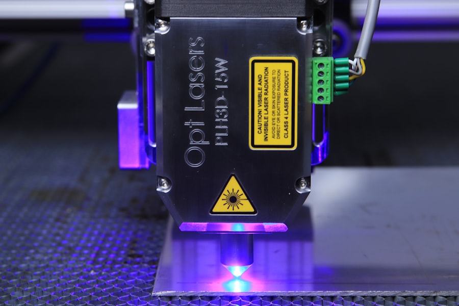
Another significant factor is the engraving technique itself. The settings on the engraving machine, such as speed and power, can dramatically influence how the font weight is rendered. If I set the machine to a higher speed, for example, it may not cut deeply enough into the material, resulting in a lighter font weight.
On the other hand, using too much power can lead to excessive burning or chipping, which can also alter the perceived weight of the font. Understanding these variables is crucial for me as an engraver, as they directly impact the quality and consistency of my work.
Impact of Font Weight Discrepancy on Engraving Quality

The impact of font weight discrepancy on engraving quality cannot be overstated. When I see inconsistencies in font weight, it often leads to a perception of unprofessionalism or carelessness in the work. Clients expect precision and attention to detail, and any deviation from their expectations can result in dissatisfaction.
In my own projects, I have noticed that even minor discrepancies can draw attention away from the overall design and message, making it essential to address these issues proactively. Moreover, font weight discrepancies can affect readability. If certain letters appear bolder than others, it can create confusion for the viewer and detract from the intended message.
This is particularly important in applications where clarity is paramount, such as signage or memorial plaques. I have learned that ensuring consistent font weight not only enhances the visual appeal of my work but also ensures that the message is communicated effectively and clearly.
Identifying Font Weight Discrepancy in Engraved Materials
Identifying font weight discrepancies in engraved materials requires a keen eye and an understanding of typography principles. When I examine my work or that of others, I often look for variations in thickness among characters. This involves comparing letters side by side to assess whether they maintain a consistent weight throughout.
I find that using a magnifying glass or loupe can be particularly helpful in spotting subtle differences that might otherwise go unnoticed. Additionally, I have learned to pay attention to specific letters that are more prone to discrepancies due to their shapes. For instance, letters like “b,” “d,” and “p” often have varying weights depending on their design and how they are engraved.
By familiarizing myself with these nuances, I can better identify potential issues before they become problematic. This proactive approach not only improves my work but also enhances my reputation as an engraver who values quality and precision.
Tools and Techniques for Detecting Font Weight Issues
| Font Weight | Engraving Depth (microns) | Discrepancy (%) | Recommended Adjustment | Notes |
|---|---|---|---|---|
| Light (100-300) | 15 | 5% | Increase laser power by 3% | Minor under-engraving observed |
| Regular (400-500) | 20 | 2% | No adjustment needed | Engraving depth consistent |
| Medium (600) | 22 | 4% | Increase laser power by 2% | Slight under-engraving on thicker strokes |
| Bold (700-900) | 28 | 8% | Decrease laser power by 5% | Over-engraving on thick strokes |
| Black (900+) | 32 | 10% | Decrease laser power by 7% | Significant over-engraving, adjust settings |
To effectively detect font weight issues in my engraving projects, I have found several tools and techniques invaluable. One of my go-to methods is using digital software that allows me to analyze font weights before engraving begins. Programs like Adobe Illustrator enable me to manipulate text and visualize how different weights will appear when engraved.
This preemptive step helps me make informed decisions about which fonts to use and how they will translate onto various materials. In addition to software tools, I also rely on physical samples for comparison.
This hands-on approach allows me to fine-tune my techniques and ensure that I achieve consistent results across all projects. By combining digital analysis with practical experimentation, I am better equipped to detect and address font weight issues before they impact the final product.
Addressing Font Weight Discrepancy in Engraving Processes

Addressing font weight discrepancies during the engraving process requires a combination of careful planning and adaptability. When I encounter an issue with font weight while working on a project, my first step is to assess whether adjustments can be made to the engraving settings. This might involve altering the speed or power of the machine to achieve a more consistent result.
By being willing to experiment with these parameters, I can often find a solution that enhances the overall quality of my work. Another effective strategy I employ is to communicate openly with clients about potential challenges related to font weight discrepancies. By setting realistic expectations and discussing possible solutions upfront, I can foster a collaborative environment that allows for adjustments if necessary.
This transparency not only builds trust with clients but also empowers me to deliver a final product that meets their vision while maintaining high standards of quality.
Importance of Consistent Font Weight in Engraving
The importance of consistent font weight in engraving extends beyond mere aesthetics; it plays a crucial role in conveying professionalism and attention to detail. As I reflect on my experiences, I recognize that clients often judge the quality of my work based on how well I manage these subtleties. A consistent font weight not only enhances visual appeal but also reinforces the message being communicated through the engraving.
Moreover, consistent font weight contributes to brand identity for businesses that utilize engraving for signage or promotional materials. When clients see uniformity in font weight across various applications, it reinforces their perception of a cohesive brand image. In my own practice, I strive to maintain this consistency not only for individual projects but also across my portfolio as a whole, ensuring that each piece reflects my commitment to quality craftsmanship.
Preventing Font Weight Issues in Engraving
Preventing font weight issues in engraving requires a proactive approach throughout the design and production processes. One key strategy I employ is thorough planning before beginning any project. This includes selecting appropriate fonts that are known for their consistency and suitability for engraving applications.
By choosing typefaces specifically designed for this purpose, I can minimize potential discrepancies from the outset. Additionally, I have found that conducting thorough tests on different materials before committing to a final design is invaluable. By experimenting with various fonts and settings on sample pieces, I can identify potential issues early on and make necessary adjustments before moving forward with larger projects.
This preventive approach not only saves time but also ensures that I deliver high-quality engravings that meet client expectations.
Collaborating with Font Designers to Ensure Consistency
Collaboration with font designers has become an essential aspect of my work as an engraver seeking consistency in font weight. By engaging with designers who specialize in creating typefaces for engraving applications, I gain insights into which fonts are best suited for specific materials and techniques. This collaboration allows me to make informed choices about typography that align with both aesthetic goals and practical considerations.
Furthermore, working closely with font designers enables me to provide feedback based on my experiences with different typefaces during the engraving process. This two-way communication fosters innovation and helps designers create fonts that are optimized for engraving applications. As I continue to build these relationships within the industry, I find that collaboration not only enhances my own work but also contributes to advancements in typography for engraving as a whole.
Strategies for Correcting Font Weight Discrepancy in Engraving
When faced with font weight discrepancies during an engraving project, having effective strategies for correction is crucial. One approach I often take is adjusting the design digitally before proceeding with further engravings. By using graphic design software, I can manipulate individual letters or entire words to achieve a more balanced appearance before committing them to material.
In some cases, it may be necessary to revisit the engraving settings themselves if discrepancies arise during production. This could involve recalibrating the machine or experimenting with different tools to achieve a more consistent result. By remaining flexible and open-minded throughout this process, I can often find solutions that enhance both the quality of my work and client satisfaction.
Future Trends in Font Weight Management for Engraving
As technology continues to evolve within the engraving industry, I anticipate exciting trends emerging around font weight management. One area poised for growth is the integration of artificial intelligence (AI) into design software used by engravers like myself. AI algorithms could analyze existing designs and suggest optimal settings based on material properties and desired outcomes—streamlining workflows while ensuring consistency across projects.
Additionally, advancements in laser engraving technology may lead to new possibilities for achieving precise font weights across various materials without compromising quality or readability. As these innovations unfold, I look forward to exploring how they can enhance my craft while addressing ongoing challenges related to font weight discrepancies. In conclusion, understanding and managing font weight discrepancies is essential for anyone involved in engraving.
From identifying common causes to implementing effective strategies for correction and prevention, each step plays a vital role in ensuring high-quality results that meet client expectations. As I continue my journey as an engraver, I remain committed to honing my skills and embracing new technologies that will help me navigate this intricate aspect of my craft with confidence and precision.
In exploring the nuances of font weight and its impact on engraving discrepancies, it’s insightful to refer to a related article that delves deeper into typographic standards and their practical applications. For more information, you can read the article on this topic at this link.
FAQs
What is font weight engraving discrepancy?
Font weight engraving discrepancy refers to the difference or inconsistency in the thickness or boldness of engraved text compared to the intended or digital font weight. This can occur due to limitations in engraving technology or material properties.
What causes font weight engraving discrepancies?
Discrepancies can be caused by factors such as the engraving method used (laser, mechanical, chemical), the material being engraved, the resolution of the engraving device, and the settings for depth and speed during the engraving process.
How can font weight discrepancies affect the final engraved product?
Discrepancies can lead to text that appears too thin, too thick, or uneven, which may reduce readability, aesthetic appeal, and the overall quality of the engraved item.
Can font weight discrepancies be minimized or corrected?
Yes, by adjusting engraving parameters, choosing appropriate fonts designed for engraving, using higher resolution engraving equipment, and testing on sample materials, discrepancies can be minimized.
Are certain fonts better suited to avoid engraving weight discrepancies?
Fonts with simple, clean lines and moderate stroke widths tend to engrave more consistently. Avoiding very thin or highly detailed fonts can reduce the risk of discrepancies.
Does the type of material impact font weight engraving discrepancies?
Yes, different materials respond differently to engraving. Softer materials may cause bleeding or spreading of the engraved lines, while harder materials may produce sharper, more precise engravings.
Is font weight engraving discrepancy a common issue in all engraving methods?
While it can occur in all methods, the extent varies. Laser engraving often offers better control over font weight compared to mechanical engraving, but each method has its own limitations.
How can designers prepare their artwork to reduce font weight engraving discrepancies?
Designers can use vector graphics with clear outlines, avoid extremely thin strokes, and consult with engravers to understand the limitations and adjust font weights accordingly before finalizing designs.


