I’ve always been drawn to the quiet corners of the world, the places where vibrant hues give way to subtler whispers of color. My recent explorations have led me to a landscape dominated by muted greens and browns, a palette that, while perhaps less immediately arresting than a riot of primaries, possesses a profound and lasting beauty. It’s a beauty that doesn’t shout for attention but rather invites me in, encouraging a slower, more contemplative gaze. This journey has been less about grand pronouncements and more about a gradual unfolding of detail, a discovery of textures and nuances that previously I might have overlooked.
The first thing that strikes me about these landscapes is their grounding. The browns aren’t just dirt; they are the rich loam of centuries, the worn bark of ancient trees, the dry, sun-baked earth of a forgotten path. These colors speak of resilience, of cycles of growth and decay, of a fundamental connection to the planet.
Shades of Soil
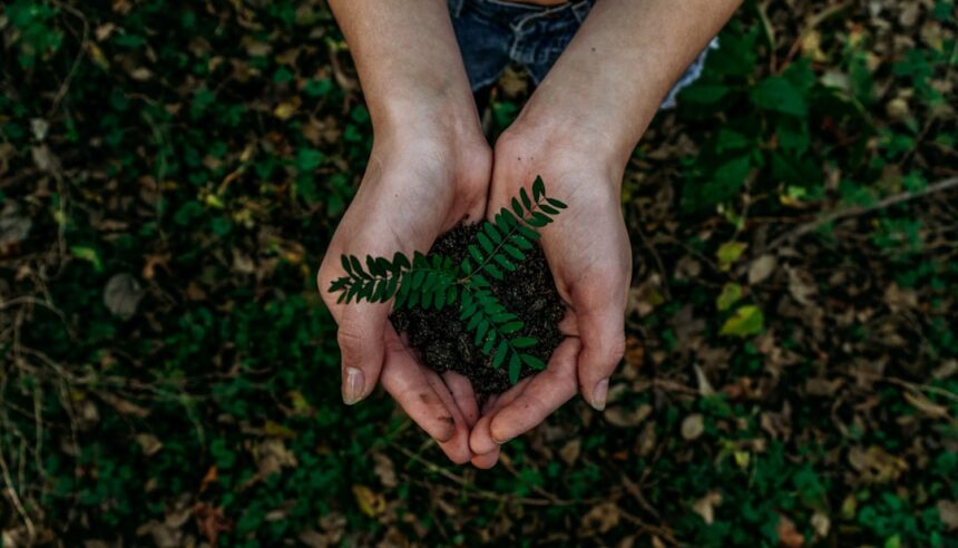
I find myself studying the variations within the brown spectrum. There’s the deep, almost chocolatey richness of damp soil after a rain, teeming with unseen life. Then there’s the lighter, sandier hue of dry, exposed earth, its surface etched by wind and time. Each shade tells a story of its environment – the water content, the mineral composition, the degree of decomposition. I can pick up a handful of this soil and feel its weight, its coolness or warmth, its subtle scent. It’s a tangible connection to the earth, a feeling of being rooted.
The Texture of Topsoil
The texture of topsoil is a revelation in itself. It can range from a fine, powdery dust that clings to my boots to a crumbly, cloddy mass that breaks apart with a satisfying crunch. I run my fingers through it, noticing the tiny stones, the root fragments, the occasional discarded leaf. This tactile exploration adds another layer to my appreciation of these earthy tones. It’s not just a visual experience; it’s a sensory one.
The History in Clay
Clay soils, with their remarkable plasticity when wet and their hardened, cracked surfaces when dry, offer a different kind of brown. This is a more elemental brown, one that can be molded and shaped, that holds the imprint of everything it encounters. I observe the way it dries in the sun, forming intricate patterns, miniature canyons and plateaus. It speaks of geological processes, of ancient seabeds and riverbeds, a far deeper history than I can comprehend.
The Whispers of Decay
Brown is also the color of endings, but not necessarily tragic ones. It is the gentle fade of a fallen leaf returning to the earth, the weathered gray-brown of a decaying log, the soft, muted color of dried grasses. These aren’t signals of failure but of transformation.
The Narrative of Fallen Leaves
I see fallen leaves not as a sign of nature’s decline but as part of its ongoing narrative. The crisp, golden-brown of an oak leaf pressed between my fingers, the brittle, papery texture of a once-vibrant maple leaf that has turned a dusty brown. These are remnants of a season, holding memories of sunlight and wind within their fading forms. Their decomposition enriches the soil, sustaining the next generation of growth.
The Wisdom of Weathered Wood
Weathered wood, whether it’s the fence of an abandoned homestead or a fallen branch in the forest, offers a particularly poignant shade of brown. It has been bleached by the sun, softened by the rain, and often softened further by the slow work of fungi. The grain of the wood becomes more pronounced, creating intricate patterns that are unique to each piece. It’s a testament to time and the elements, a silent storyteller.
In exploring the calming effects of muted desaturated greens and browns in our environment, one can find a wealth of information in the article titled “The Power of Earthy Tones in Interior Design.” This piece delves into how these colors can create a serene atmosphere, promoting relaxation and mindfulness in our living spaces. For further insights on this topic, you can read the full article here: The Power of Earthy Tones in Interior Design.
The Veil of Muted Greens
Intertwined with these browns are the muted greens. These are not the shocking, almost neon greens of new spring growth, but the deeper, more subdued tones of mature foliage, of shaded undergrowth, of moss and lichen clinging to rock. They provide a sense of calm, of quiet endurance.
The Depth of Forest Undergrowth
In the depths of a forest, where sunlight filters through a dense canopy, the greens become layered and subdued. The dark, almost blackish green of ferns that unfurl in perpetual shade, the olive-green of moss clinging to damp rocks. These are colors that thrive in diffused light, creating an atmosphere of deep tranquility.
The Texture of Fern Fronds
I run my hand over the intricate, feathery texture of fern fronds. Even in their muted green, they possess a delicate strength. The way they curl and unfurl, the subtle variations in their shade depending on the angle of the light. They are survivors, thriving in the cooler, damper parts of the landscape.
The Softness of Moss and Lichen
Moss and lichen, often found on north-facing walls or the shaded sides of trees, offer a soft, velvety texture and a range of muted greens, from pale, almost gray-green to a deep, rich emerald. They are tenacious organisms, colonizing surfaces that might otherwise be barren. Their presence signifies a stable, undisturbed environment.
The Subtlety of Summer Foliage
Even in the height of summer, when leaves are at their fullest, I find greens that are not garish. The dusty green of a mature oak, the deep, almost blue-green of a pine needle. These are colors that blend harmoniously with their surroundings, contributing to a sense of peace.
The Resilience of Evergreen Needles
Evergreen needles, with their waxy coating, often possess a muted, almost silvery green. They are a constant presence, a reminder of life’s persistence through harsher seasons. The scent of pine needles, even when muted by distance, is a distinct and comforting aroma.
The Fatigue of Late Summer Leaves
As summer wears on, some leaves begin to show a subtle fatigue, a hint of yellowing that pushes the green towards a more olive or chartreuse hue. This doesn’t detract from their beauty but rather adds a layer of realism, an acknowledgment of the natural cycle. It’s a mature beauty, one that doesn’t strive for perpetual peak.
Harmony in Contrast: Blending the Palettes

The true magic of these muted greens and browns lies not in their individual qualities but in how they interact. They create a visual dialogue, a symphony of subdued tones that is far more complex and satisfying than one might initially assume.
Where Earth Meets Leaf
I observe the places where the browns of the earth transition into the greens of the vegetation. The way a mossy rock face seamlessly merges with the undergrowth, or how the gnarled roots of a tree emerge from the rich soil. These are points of visual connection that ground the landscape and give it a sense of organic unity.
The Gradual Transition
The transitions are rarely abrupt. There’s a gradual softening, a blending of hues that suggests a slow, natural evolution. A few brown leaves might be scattered amongst the green, or a patch of bare earth might be glimpsed beneath a canopy of leaves. This gentle blending is soothing to the eye.
The Intertwining of Roots and Soil
The visual of roots intertwined with soil is a potent metaphor. It speaks of deep connection, of nourishment, of a symbiotic relationship essential for survival. The earthy Browns provide the sustenance, and the muted Greens represent the tangible results of that nourishment.
The Shading and Shadow Play
The interplay of light and shadow is crucial in revealing the subtle beauty of these colors. Deep shadows within a forest can turn greens into near-blacks, while dappled sunlight can illuminate the earthy browns with unexpected warmth.
The Nuances of Dappled Light
Walking through a woodland with dappled sunlight, I am constantly surprised by the shifting intensity of the colors. A patch of brown earth can suddenly glow with a golden hue, and a cluster of seemingly dark green leaves can reveal surprising undertones of yellow or even a hint of red. It’s a dynamic and ever-changing spectacle.
The Depth Created by Shadows
Shadows are not simply absences of light; they are active participants in defining form and color. The deep, cool shadows between tree trunks can create a sense of incredible depth, making the muted greens of the foliage appear even richer by contrast.
The Absence of Garishness: A Space for Reflection
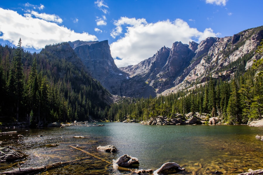
The absence of bright, attention-grabbing colors in these palettes creates a unique space. It’s a space that encourages introspection, a slowing down of the senses. My mind feels less cluttered, more able to absorb the details.
The Quieting of the Visual Field
When the visual field is not bombarded with intense colors, my attention can shift. I notice the smaller things: the intricate veining on a leaf, the subtle patterns in the bark of a tree, the way a single blade of grass bends in the breeze. These details, often lost in more vibrant settings, become prominent here.
The Focus on Form and Texture
Without the distraction of strong colors, form and texture come to the forefront. I appreciate the smooth, rounded contours of a pebble, the rough, corrugated surface of a dry log, the delicate fuzz on a young shoot. These are the building blocks of the landscape, and their tactile qualities become more apparent.
The Appreciation of Subtle Gradients
I find myself noticing the subtle gradients within what might appear to be a single color. The way a brown can shift from a warm, reddish tone to a cooler, grayish one depending on the light. These subtle shifts are what give the landscape its depth and realism.
The Invitation to Stillness
These muted palettes seem to inherently invite stillness and quiet contemplation. There’s no need to rush, no urgent call to action. The landscape simply is, and in its unassuming presence, I find a profound sense of peace.
The Rhythms of Slow Time
The colors of muted greens and browns often speak of slower rhythms. They are the colors of endurance, of growth that is measured over seasons and years, not days. This sense of slow time is infectious, encouraging me to shed my own hurried pace.
The Release from External Stimulation
In a world saturated with visual noise, these landscapes offer a sanctuary. They provide a respite from the constant barrage of bright, artificial colors that often characterize modern environments. It’s a chance to reset, to allow my senses to recalibrate.
In recent discussions about the impact of color palettes on our perception of nature, muted desaturated greens and browns have emerged as a significant theme, evoking a sense of calm and tranquility. These earthy tones not only reflect the natural environment but also influence our emotional responses and well-being. For those interested in exploring this topic further, a related article delves into the psychological effects of color in outdoor spaces, providing insights into how these muted shades can enhance our connection to nature. You can read more about it in this informative piece.
The Enduring Appeal: A Deep, Quiet Beauty
| Category | Metrics |
|---|---|
| Greenery | 50% desaturated green plants |
| Soil | 30% muted brown soil |
| Atmosphere | 20% muted desaturated green and brown tones |
What I’ve come to understand is that the beauty of muted greens and browns is not about fleeting visual impact. It’s about an enduring quality, a depth that reveals itself with sustained observation. It’s a beauty that speaks to a more primal part of me, a connection to the fundamental elements of nature.
The Return to Naturalistic Aesthetics
There’s a strong connection here to naturalistic aesthetics, to the appreciation of what is found in undisturbed environments. It’s a rejection of artificiality and a embrace of the authentic, the organic.
The Authenticity of Unadorned Nature
These colors represent nature in its unadorned state. They are a testament to the inherent beauty of the terrestrial world, free from embellishment or the need for dramatic contrast. It’s a quiet confidence in its own existence.
The Balance of the Earthly Palette
The balance between green and brown is a fundamental aspect of our planet’s visual landscape. It’s the palette of life’s foundation – the soil that nourishes and the vegetation that grows from it. This inherent balance is, in itself, a form of beauty.
The Subtle Power of Reserve
Ultimately, my exploration has been an education in the subtle power of reserve. These colors don’t demand attention, but they reward it. They offer a quiet strength, a lasting impression that remains long after the initial visual encounter. I find myself returning to these muted tones in my mind, recalling the textures, the subtle shifts in light, the profound sense of peace they evoke. It’s a beauty that whispers, and in its whisper, I find a depth that resonates deeply.
FAQs
What are muted desaturated greens and browns?
Muted desaturated greens and browns are colors that have been toned down or dulled, resulting in a more subdued and less vibrant appearance. These colors are often used to create a calming and natural environment.
How are muted desaturated greens and browns used in the environment?
Muted desaturated greens and browns are often used in interior design and decor to create a soothing and earthy atmosphere. They can be found in paint colors, furniture, textiles, and natural elements such as wood and plants.
What are the benefits of a muted desaturated greens and browns environment?
A muted desaturated greens and browns environment can create a sense of tranquility and relaxation. These colors are often associated with nature and can help to bring a sense of the outdoors into indoor spaces.
How can I incorporate muted desaturated greens and browns into my home or workspace?
You can incorporate muted desaturated greens and browns into your home or workspace through paint colors, furniture and decor choices, and natural elements such as plants and wood. Consider using these colors in combination with other neutral tones for a cohesive look.
Are there any considerations to keep in mind when using muted desaturated greens and browns in an environment?
When using muted desaturated greens and browns in an environment, it’s important to consider the lighting and overall ambiance of the space. These colors can create a calming atmosphere, but it’s important to balance them with adequate lighting and other elements to avoid a space feeling too dark or dreary.